Roskilde Karate: Reimagined
We helped the Danish non-profit organization, Roskilde Karate Klub, redefine their brand. Our goal was to better showcase their values, the benefits of training, and their strong community, attracting new members while respecting their heritage.
brand strategy
visual identity
website design
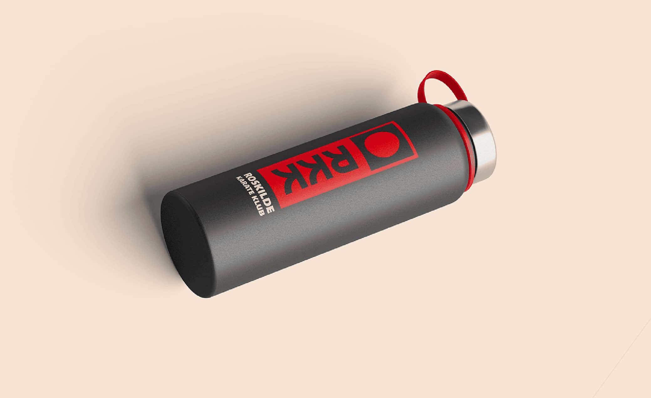
merchandise


Our Rebranding Journey
Our adventure began with a deep dive into Roskilde Karate Klub's current vibe. We then kicked off a full-day workshop with the board and awesome volunteer instructors. Picture this: a room buzzing with ideas, tackling everything from their dream audience to values and brand associations.
After sifting through all that golden intel, we zipped back to the board with our findings, making sure everyone was on the same page. Once we had that green light, we cooked up a fresh brand direction and a snazzy new visual identity.
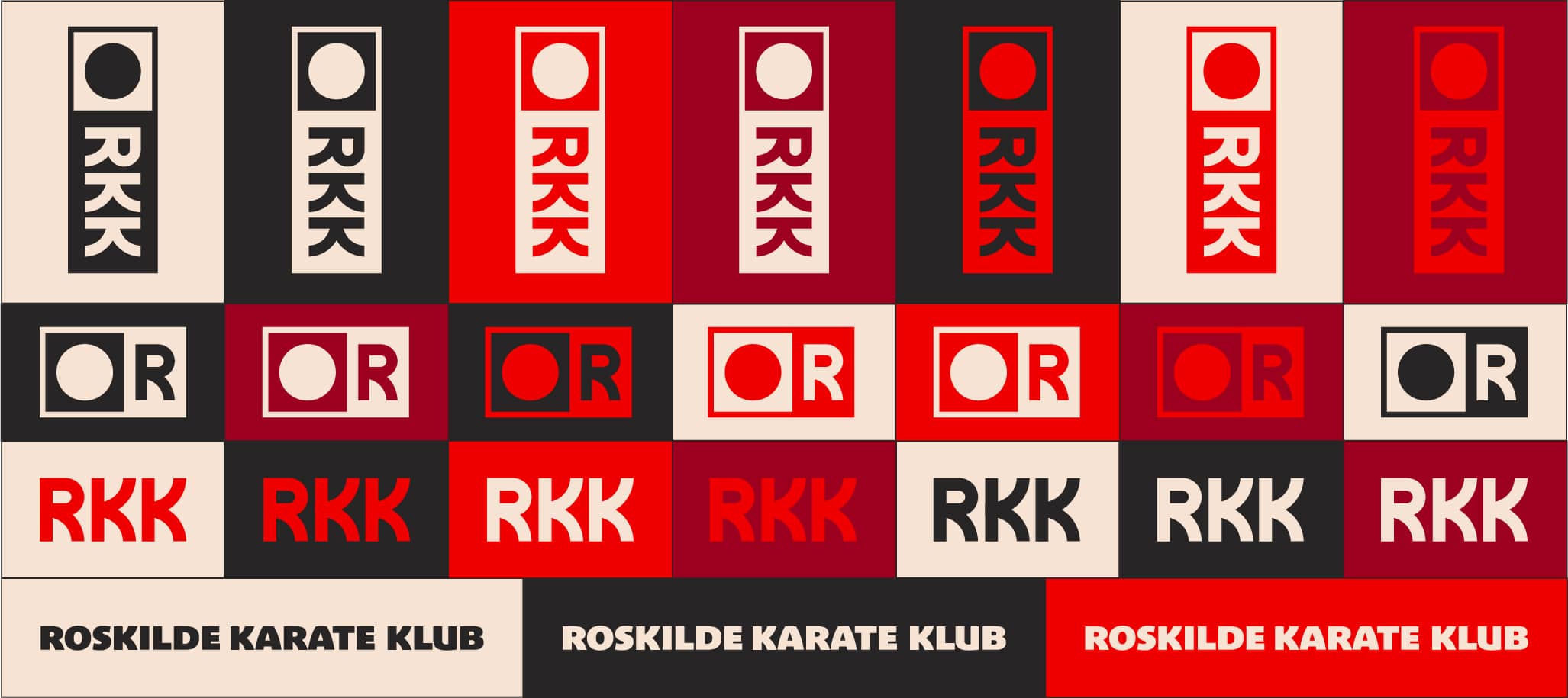
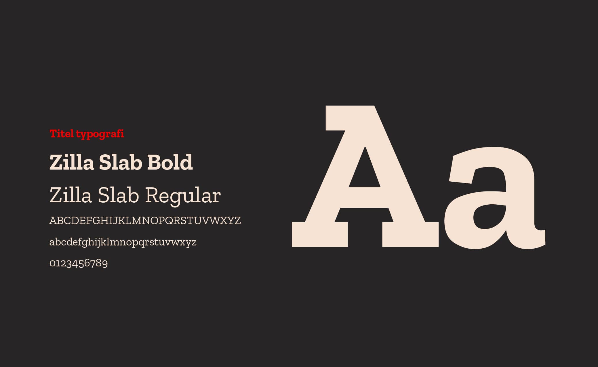
The Foundation: Bringing the brand to life was an exciting journey. We built Roskilde Karate Klub's visual identity around core associations like community, safety, strength, high quality, and respect. From these, we crafted clear design principles to guide all visual and communicative elements.
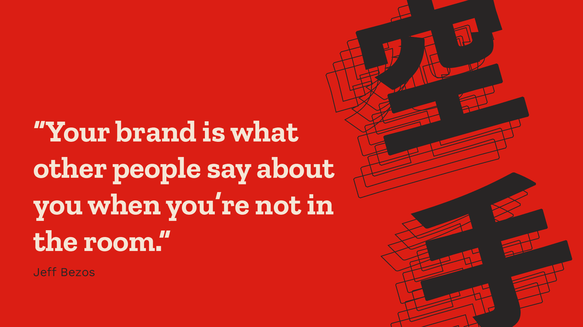
Inspired by Heritage: The brand draws deep inspiration from karate's rich heritage, incorporating Japanese art and aesthetics. You'll see a minimalistic and simple design, often featuring straight lines and corners, subtly hinting at karate's inherent strength, structure, and discipline.
Balance and Approachability: Yet, it's carefully balanced with softer colors and the traditional red and circle, a clear nod to Japan and the club's human-centric approach. We've ensured clear and inclusive communication , with dynamic movement integrated throughout the new website to truly reflect the club's spirit and appeal to its primary audience of children, youth, and their parents.
Crafting the Visual Story


Bringing the Brand to Life
A brand's true power isn't just in its design; it's in how it comes alive and functions within its intended context. For Roskilde Karate Klub, this meant ensuring their new identity was not only visually striking but also practical and effective in real-world application.


The successful rollout of the refreshed brand will allowed Roskilde Karate Klub to present itself with renewed clarity and appeal, directly engaging its target audience and reinforcing its community values.
The new identity will soon be actively at work, strengthening their presence and welcoming new members.
Deliverables
workshop facilitation
target audience clarification
logo design
visual brand identity
brand book and guidelines
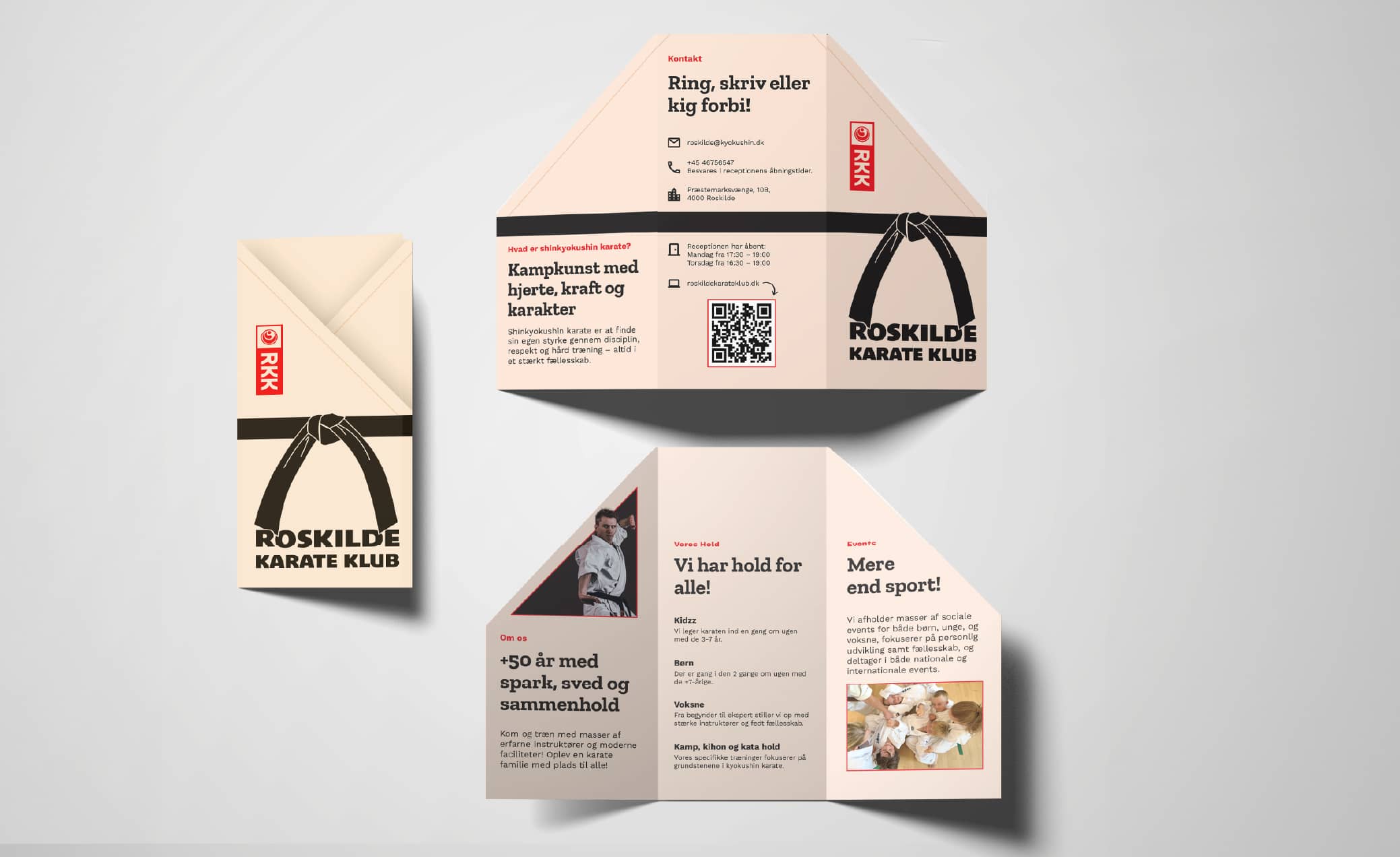
new website
merchandise and handouts
marketing suggestions

